Creating sound memories to share with friends
Concept Project: Making a playlist community in SoundHound

2 week design sprint, July 2021
My role: UX Researcher and Designer – Discovery, User Research, Wireframing, Testing
Tools used: Figma, Miro
This is a speculative project where my team of three designers ideated and prototyped a new feature for the music identifying app, SoundHound. Based on insights from our user research, we designed a social feature within SoundHound where users could create and share playlists with friends and the larger SoundHound community. As someone who is not a big music app user, I was excited to unleash my curiosity by learning more about user habits and pain points through surveys and interviews.
Composing a Melody
Before we could design our feature, we needed to understand SoundHound’s business goals and determine the user needs. In order to get a sense of how consumers perceived SoundHound in the music app landscape, I conducted an online survey. No one in our team was familiar with SoundHound, and only one survey taker out of 24 admitted to using the app. Our survey results indicated that Shazam dominated the music identifying scene, with Siri coming in a close second. Other popular music apps were Spotify, Apple Music, and YouTube.


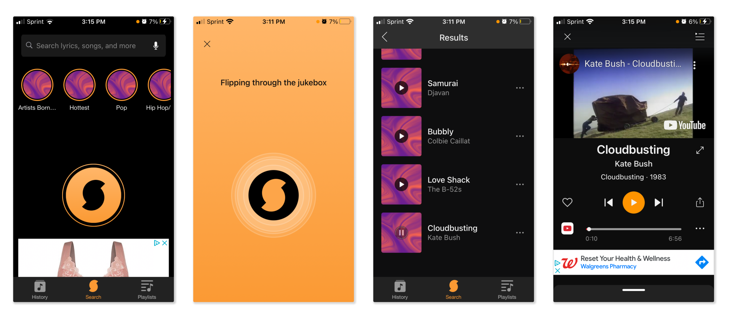
Images sourced from SoundHound app
UX Audit
SoundHound’s core function is as a music identifying app, so the primary user flow centers song identification and searching. By pressing on the pulsating logo on the home screen, the user is taken to a music identification screen, where they can identify a song based on what’s playing or hum a tune (in this case, I sang the first line from Kate Bush’s “Cloudbusting”). From there, a list of potential matches pops up, and you can listen to the whole song with an integration with Spotify, Apple Music, or YouTube.
Establishing Industry Standards
Since we were working with a tight timeline, and since users employed a variety of methods to identify music, we broadened our research pool to collect insights about both music identifying apps and music streaming apps. Although SoundHound had superior voice recognition technology, Shazam was the top music identifying app on the iOS App Store. While both Shazam and SoundHound allowed the user to listen to music that they had identified and kept that history in a playlist, the apps’ playlist creation and sharing capacity was primarily conducted through integration with external apps, like Spotify or Apple Music, which had far more robust playlist features.

C&C chart created by my colleague
"Playlists feel like journals that go back to the time when I was listening to this music"
"Playlists become diaries for specific times."
"I wish it was easier to search for user-made playlists on Apple Music."
User Interviews
As the UX Researcher for our team, I conducted interviews to discover user patterns and pain points. Through the interviews, I discovered that music apps generated strong emotional responses. All users interviewed created their own playlists for working, exercising, commuting, and relaxing with friends. While they used music identifying apps like Shazam on a weekly basis, they used their music streaming apps like Spotify or Apple Music daily.
Two Spotify users compared their playlists to diaries that transported them to a specific moment in their lives when they had created and listened to those playlists–think of the Proustian moment at the end of Ratatouille. Although both users liked sharing features, because these playlists were so personal, they wanted to share them with a specific person or small group of people rather than all Spotify users. One user in particular wanted greater customization, allowing him to upload an image for the playlist rather than relying on Spotify’s auto generated options. Another user who had recently transferred from Spotify to Apple Music lamented the lack of a robust community of user-generated playlists in Apple Music. She fondly remembered an app called 8tracks where users shared their own themed playlists.
How do you solve a problem like SoundHound?

Affinity Map
As a team, we synthesized the insights from user interviews by building an affinity map together. This was a great team exercise, because it familiarized the other designers with the results from the user interviews I’d conducted on my own. The areas we targeted were playlist creation and sharing features. Based on the categories with the most post-its, we developed a persona, problem statement, and some How Might We statements to get the possible solutions flowing.

Persona created in collaboration with my colleague
Problem Statement, take 1
Cassie needs to identify music and create and share playlists in the same app because she prefers not to switch between apps and wants to share her music with friends on social media.
How might we help Cassie connect with friends and family through music?
How might we improve the Sound Hound app experience so Cassie is more motivated to use it?
How might we add more functionality to Sound Hound so that Cassie can easily identify music and see friends’ playlists using the same music identifying app?
How might we make opportunities for Cassie to identify music and share playlists within the same existing music app?
User Flow, take 1
Based on this synthesis, we developed our user flow. But when we started wireframing, this didn’t seem like a new feature separate from the primary user flow because we also began by searching for a song.

Back to the Recording Studio
We went back to the affinity map and decided to refocus along the lines of sharing and community. We revised the problem statement according to this shifted area of focus.

Based on this new target, we created a new problem statement and user flow that highlighted sharing within SoundHound rather than sharing to an external social media app. The revised user flow still included the feature of creating playlists, which was a major user interest according to our research.
Problem Statement, take 2
Cassie needs a way to share friends’ playlists within Sound Hound because she prefers not to switch between apps and wants to learn about new music from friends.
User Flow, take 2

Working in Harmony

Wireframes iterations. The frames on the right are the final collaborative low fi frames, created by our UI Designer
Wireframes and Design Studio
To generate the greatest possible amount of ideas for the layout and flow of our feature, our team conducted a design studio where we each sketched wireframes for a potential solution. My wireflow kept much of the layout from SoundHound, such as the original song page, to maintain consistency with the design system of the existing app. All of our wireframes took a different approach but presented valuable ideas that we incorporated into the final lo fi prototype.
During a 2-hour meeting, we created a wireflow by drawing on ideas from all of our sketches. Working collaboratively strengthened our design by allowing us to choose the strongest ideas that best addressed business goals and user needs!
We adopted one designer’s use of a checkmark to confirm that a song had been added to the user’s playlist. We combined layout ideas from my version of the playlist page and another designer’s version. Our final low fi iteration of the community page also drew from my wireframes and other designers’ ideas.
That Old, Familiar Refrain
A member of our design team conducted the first round of usability testing. He asked users to find their friend Frederick’s playlist, select the Billie Eilish song from that playlist, add that song to a new playlist, and then go listen to the playlist. We discovered that users did not find the new community icon intuitive–one user compared it to a dog’s paw. Additionally, since we retained the SoundHound layout of the song page, users had difficulty ascertaining where to click to add the song to a playlist. This led our UI designer to iterate on the icons and switch out the share icon on the song page to a plus icon, indicating “add to playlist.”

Iterations: changes to the icons in the bottom navigation bar, switching out add to playlist icon for sharing icon to encourage users to remain within SoundHound, alteration of the icon order in the pull up menu to reflect the feature’s new priorities.
Following these iterations, our UI Designer created a Design System and brought the prototype up to mid fidelity for the second round of usability testing.

Design system created by our UI Designer
Reprise
I ran the second round of usability testing, collecting qualitative and quantitative data based on these tasks and goals.
Goals:
Users will be able to browse their friends’ latest playlists in under 2 minutes with fewer than one error.
Users will be able to add a song to their playlist in under 2 minutes with fewer than one error.
Users will be able to create a new playlist within 1 minute with fewer than one error.
Metrics:
Time, number of errors, overall feeling of satisfaction
Tasks:
Browse your friends’ latest playlists
Find your friend Frederick’s latest playlist
Select the Billie Eilish song and add it to a new playlist
Go listen to that new playlist

Unanticipated User Paths
When synthesizing the results of the usability testing, I noticed two surprising trends. Most users immediately recognized the circles at the top of the screen as similar to Instagram stories–they knew those pictures represented their friends’ avatars. That motivated them to click directly through to those images in response to the task “Browse your friends’ latest playlists,” rather than selecting the community icon in the bottom navigation bar, which is the behavior that we predicted in the user flow.
This resulted in a huge discrepancy between our goal time for the task, 2 minutes, and the average user time, 16.25 seconds.
Shortcuts
The other trend I noticed is that users were already familiar with apps like Spotify, so they knew that three dots aligned with the song would allow them to add it to a playlist without clicking through to the song page. In other words, by staying within the design system of SoundHound, we fulfilled Nielsen’s usability principle #7, allowing for flexibility and efficiency of use through shortcuts.
While this familiarity resulted in another gap between our goal time for the task of “add song to a playlist,” 2 minutes, and the average user time, 11.25 seconds, it also resulted in the greatest number of user errors because we had neglected to link the plus icon in the pull up menu in our prototype–something we fixed in the MVP.

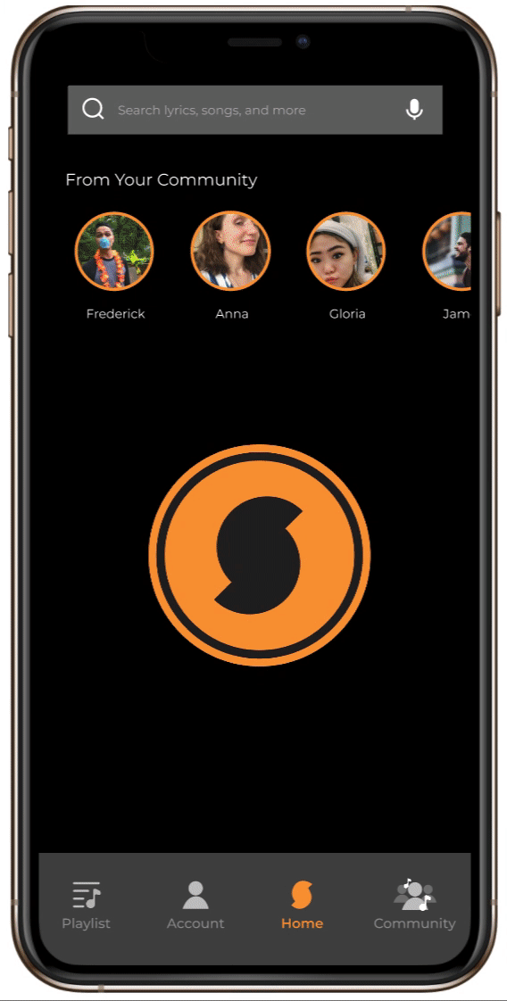
Image Sources: curated new music, top 100, pop, Justin, Kathy, Chris, picnic, red wine, workworkwork, NDA, Stay, Kiss Me More, So High, PYNK, New Work Jamzz, TikTok, YouTube, Film Tracks
Final Iterations and MVP
Ultimately, although users found shortcuts through our user flow, we discovered that the friends’ profiles in the stories at the top of the home screen distracted users from clicking through and exploring our new community page. We decided more UX writing was needed to guide the user through the new feature. We implemented “From your community” text above the circles connecting them to the “community” icon in the navigation bar below in the final prototype. Other iterations discussed were adding a circle with the SoundHound logo in the stories circles to direct users to the new feature and adding an onboarding page alerting users to the new feature.
Another avenue our design team would like to explore involves incorporating SoundHound’s Voice Control technology, which sets it apart from Shazam, into the new feature. Allowing voice direction, such as “Hey SoundHound, play Frederick’s latest playlist,” could be another way to distinguish SoundHound within the crowded music app landscape.
Coda
Take it from the top
If we were to pursue this project again, I would change my approach to the user interviews. Because no one we interviewed was a current SoundHound user, I broadened our interview questions to include user patterns and pain points in music streaming apps as well as music identifying apps. When we presented our feature, however, our stakeholders were confused about the original core function of SoundHound. To fix this, I would ask more “why” questions about the root causes that motivate people to use apps to identify music. This insight might have allowed us to develop a feature more closely aligned with the core function of SoundHound. I would also devote more time to recruiting SoundHound users for interviews, as well as conducting contextual inquiry to observe user patterns and pain points first hand.
Iteration, Iteration, Iteration
One valuable thing I learned from this process was not to be too attached to the first user flow. By working together as a team, we iterated on our initial user flow and developed a new one that more clearly responded to user needs as expressed by our research!