Translating the local feel of an indie bookstore into a digital experience
Concept Project: Designing a responsive e-commerce site for Malvern Books

Image Sources: Malvern Books Shopify, Malvern Books Website, VSATexas, Amazon, Narissa J. on FourSquare
2 week design sprint, June-July 2021
My role: UX Researcher and UX/UI Designer– Discovery, C&C Analysis, Wireframing, Prototyping, UI Design, Testing
Tools used: Figma, kardSort
This is a passion project where I designed an e-commerce site for an existing business, Malvern Books in Austin, TX. Since I have a PhD in English, I am a huge book lover, and Malvern Books specializes in highlighting small, independent presses and up-and-coming authors–a mission that I value. Pre-COVID, they were also known for being a community gathering space, hosting open mic nights, book release parties, and even ice cream socials. I had to be sure to translate that crucial aspect of their brand into their digital presence.
The Inciting Incident

Image Sources: Bookshop.org, Shopify, Malvern Books
UX Audit: A Tale of Three Websites
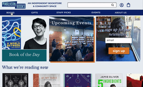
Before I started designing a new e-commerce site, I needed to investigate Malvern Books’s existing website. I discovered that they currently use three separate, linked websites to advertise their events, hours of operation, and book of the day; sell books online; and sell merchandise and gift certificates: their central WordPress site, an account on Bookshop.org, and a Shopify site, respectively. They also use slightly different branding on each site, with different logos on their WordPress and Shopify sites and their signature lion as the avatar for their Bookshop.org account.
Enter our Protagonist
After identifying problems with the existing Malvern Books site by conducting a UX audit, I needed to get a deeper understanding of my user. Enter our protagonist, Gillian G.

Persona, Photo by César León on Unsplash
Problem Statement
Gillian G. needs a quick and easy way to buy age- and interest-appropriate books and gifts for friends and family online. Because she values supporting her local community, she wants to buy from Malvern Books but wants the ease and convenience of shopping online for unique gifts.
How might we give the online experience of shopping at Malvern Books the same attention to customer service as the in-store experience by making easily navigable age- and interest-appropriate book recommendations?
How might we consolidate the e-commerce experience at Malvern Books so that Gillian G.’s online shopping experience is quick and intuitive with the fewest amount of unnecessary steps?
How might we allow Gillian G. to sort books and gifts according to price range as well as genre and age-level?
How might we translate the vital community gathering place vibe of Malvern Books to their online presence?
Finding my Muse
Competitive and Comparative Analysis
In search of examples for how other online businesses have answered these types of questions, I conducted competitive and comparative research. My competitive analysis focused on two prominent online booksellers, ThriftBooks and Amazon; two brick-and-mortar shops with online shopping options, McNally Jackson and Shakespeare and Company; and finally Bookshop, which provides an online shopping platform for independent brick and mortar bookstores like Malvern Books. Amazon and ThriftBooks feature extensive filtering options and a robust online rating and reviewing forum.
Bookshop, McNally Jackson, and Shakespeare and Co, however, were most welcoming to users who hoped to browse staff recommendations or search directly for a book–there were no filtering options and no star ratings or customer reviews. Because my user relies on recommendations and ignores reviews, this led me to focus on other features for the site, including filters, which, although not implemented in all competitors, were crucial for my user.

Image Sources: Facebook, Google, Cheapism, Shakespeare and Co, McNally Jackson
Information Architecture: The Card Catalogue
Knowing that I was going to highlight the Staff Picks aspect of independent bookstores helped me craft the site map, which was also informed by the results of card sorting research conducted remotely on five participants. This site map reflects my design strategy of targeting both user needs and business goals by allowing an easy way for my user to sort by age, genre, or category, while also highlighting staff recommendations, literary events, and a blog for staff members to post longer reflections on literature and community gatherings.

Site Map
Rising Action
User Flows
Following the site map, I designed two user flows. One primary user flow would allow Gillian to pick out an age- or interest-appropriate book, set price filters, and get the book gift wrapped and shipped.
I also designed a secondary user flow allowing Gillian to add books to a list to save for later, if she wanted to consider multiple options for a gift.

User flow 1

User flow 2
Wireframing for Responsive Design: Novel or Novella?

Mobile version of confirmation page, desktop iteration of confirmation page, mid fi version of confirmation page
Based on my user flows, I went through several iterations of wireflows and designed a responsive website.
I worked in mobile first to ensure that all the material could easily fit in that format. My responsive design used both off-canvas and layout shifter methods to convey the same information in a desktop and mobile format.

Mobile and desktop feature different primary and secondary navigation breakdowns
Design System and Final Mockup: Setting the Type and Getting Print-Ready

Because Malvern Books is dedicated to community building through hosting events in their bookstore, I chose the Malvern Books logo that is the same as their sign to best represent their brick-and-mortar location in a digital format.
I developed a color palette based on some key colors from their logo and added a complementary accent color drawn from one of their famous in-store displays. The typefaces were chosen according to harmoniousness with Malvern Books’s logo–Montserrat–and classic newsprint-feel–Libre Baskerville.
Climax and Denouement
Usability Testing
I ran tests of the grayscale mid fidelity prototype with five users. The surprise standout in my usability testing showed that my attempts to highlight staff picks with a small flag on the corner of a book were ineffective in the grayscale version. Two out of five users tested were unable to see the flag, accounting for 40% of my testing pool. Because this feature addresses both Malvern Books’s business goals and Gillian G.’s needs, the staff pick flag was an essential target for iteration.

Gift Wrap Success
Selecting a gift wrap option, on the other hand, was fairly intuitive for users and was accomplished so quickly that I was unable to measure that metric, so that design decision received validation from my tests. One user, however, wished to confirm that gift wrap was an option earlier in the checkout process, perhaps even as part of a banner ad on the home page. Since my research did not indicate that advertising gift wrapping on the homepage is an industry standard, more user research is needed to determine the desirability of that addition.


Millennial vs. Boomer Digital Preferences
The results from my usability tests indicated that more research was needed in terms of the demographics of Malvern Books’s customer base, By testing both Millennials and Boomers, I discovered different trends in their digital shopping preferences. Scrolling horizontally was totally intuitive for Millennial users but they preferred to be able to hover, rather than click, on categories in the navigation bar. Boomer users, however, wished for more explicit visual cues about how to interact with the site, including a vertical scroll bar to navigate up and down the page and arrows to indicate that users could click through to scroll horizontally.
Filters
While some users appreciated the existence of a filter-by-price feature, two out of five users expressed that they probably wouldn’t base their book purchases on cost and would be far more likely to explore based on staff picks or interesting covers. One user, however, wanted more filtering functionality and missed the left hand sidebar commonly found on ecommerce sites. Since filters are not industry standard for brick-and-mortar bookstore websites, more research is needed to determine the desirability of a more extensive filtering sidebar.

Choose Your Own Adventure: More User Paths
Although all users were able to navigate to the Young Adult page fairly easily, they expressed a number of different ways they might have accomplished the goal of selecting the book, The Hobbit, that were different from how I had broken it down based on the user flow. One participant related that she tends to go straight to the search bar, and would have probably typed in “young adult” to find the Young Adult page. Two other users said that, given that this is an independent bookstore with trustworthy staff recommendations, they would probably navigate to the Staff Picks page first and browse the YA recommendations from there. In order to ensure that the greatest number of possible routes are available for customers to find the right book, my next step for usability testing is to build out a more robust version of the prototype in order to assign more open-ended tasks. This would allow for discovering more organic user paths and create contingencies for more possible use cases.
Epilogue
Create the Design System First
Standardizing my typeface sizing and palette earlier rather than after elements have been added to the prototype is crucial for smooth communication with teammates and saves backtracking.
Information Architecture is just a Starting Point
I needed a navigation system that made sense to users in order to categorize the items in the bookstore, but I quickly discovered through usability tests that there were countless ways users preferred to reach their destinations. Making sure that items are cross-referenced, searchable, and that important categories like “staff picks” are filterable are key to successful user journeys.
Consult Clients and Developers Early and Often
As I was adding certain features, like Book of the Day or Pick up in store, I realized that I needed more information about our website’s CMS (whether this information would be easy for a staff member to update daily) or whether Malvern Books would prefer automated pick up in store functionality or something more manual that might allow more employee flexibility. If I were to implement this design for Malvern Books, I would need more conversations and iteration to ensure it was the best product for my client’s needs.
