Designing an EdTech product that educates parents without requiring them to learn new technology
Client Project: Creating a parent portal for We Intervene

My role: UX Researcher and Designer
Tools used: Jira, Calendly, Google Forms, Zoom, Figma, Figjam, Maze, UserTesting.com
3 week design sprint, August 2021
In partnership with We Intervene, my team volunteered to create a parent portal for an EdTech product that aims to consolidate referrals, resources, and communications from student support staff and to make those resources and communications available for parents and students. As someone with a lot of experience in the education industry, working with We Intervene was an exciting opportunity to leverage my prior knowledge in order to ask better questions and design more accessible, intuitive products than I’d used as an educator!
Student support staff face a problem that is far from unique in underfunded educational settings: they are one person assigned to hundreds of parents and guardians. Our client, We Intervene, created a platform where student support staff could easily and quickly track referrals and follow up in their communications with parents and guardians to make sure no student needs fall between the cracks. The administrative side of the product was already designed, but parents and guardians had to access the information, both in terms of searching for resources and following up on communications. We needed to discover what preferences and pain points parents and guardians had in terms of finding resources and interacting with EdTech platforms for their children.
Hitting the Books
Comparative and Competitive Research
I conducted some competitive and comparative analysis to determine what the industry standards were for EdTech products focusing on social and emotional learning (SEL) and products used by schools in the NYC area. The features analysis focused on competitors KiNVOLVED, IO Messenger, Pupil Path, Panorama Education, Naviance, and Class Dojo. Comparators were drawn from resource aggregation websites MyHITE and Aunt Bertha as well as CRMs and data visualization dashboards Tableau and Salesforce. I also conducted a task analysis on Pupil Path’s login process for parents.
The industry research yielded a few key insights for our current design and recommendations for features to add:
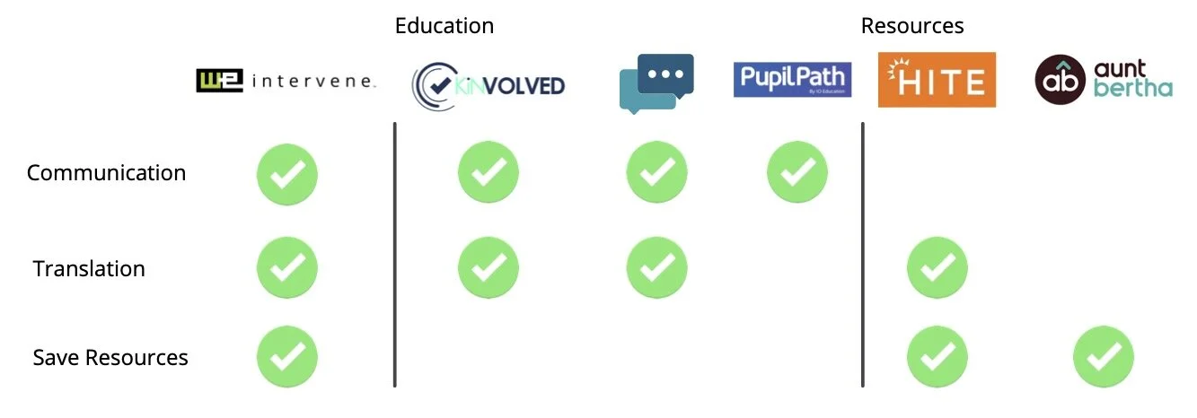
Image sources: KiNOLVED, IO Messenger, PupilPath, MyHITE, Aunt Bertha
KiNVOLVED and IO Messenger both featured two-way text messaging with parents. Pupil Path also allowed for a text messaging feature, but parents needed to know where to find those settings in order to enable it.
KiNVOLVED, IO Messenger, and MyHITE all featured translation options for users, either within the technology of the two-way text messaging or as a Google Translate API plug-in. After researching some school websites from the NYC area, I determined that Google Translate is the industry standard translation tool in the district.
MyHITE and Aunt Bertha both allowed users to save resources to their accounts for further reference, so we knew that was a feature we wanted to highlight for the parent portal as well.
Finally, I conducted a task analysis on the sign in process for parents accessing Pupil Path. The complicated process took parents from the login screen to their dashboard in the app and then back to the login portal. We knew we needed a more intuitive, streamlined onboarding process.
I discovered that the “Messages” feature not displayed unless the parent had selected the “Home” tab, which you can see in the PupilPath “Assignments” screen. Since our client reported that dropped communication was an issue for parents during COVID, this was another area we wanted to target for our parent portal.

Image source: Pupil Path
User Interviews
In order to determine parent needs, we interviewed six parents. We Intervene’s target market is the New York City area with hopes to expand from high school to middle and elementary school and from NYC to other areas in the country. We recruited parents through We Intervene’s contacts and our own networks. All but one user interviewed was a parent with at least one child in high school.


Based on these interviews, we found a few key insights:
Users liked to be able to choose their notification method (text was better for some, email better for others)
Users didn’t like a cumbersome sign in or access process
Users wanted to be able to sync important events to their calendar (some reported missing events)
Users received overwhelming amounts of information from schools and wanted to be able to prioritize and organize that information
Users spent a lot of their own time googling resources because school websites could be confusing or poorly designed
Drafting a Thesis
Based on the insights from our user interviews, we created a persona, Felicia D.

Problem Statement
Felicia needs an effective way to access and organize communication and resources from her children’s schools on the go because she receives a lot of information from her children’s schools and she has lots of work and parenting obligations.
How Might We…
allow Felicia to access communication from school in an organized and mobile-friendly format?
provide schools with a platform that consolidates communication and resources in a place that’s easily accessible to parents via phone and desktop?
allow Felicia to seamlessly view school notifications and access relevant resources/links without cumbersome steps?
help schools prioritize communications so Felicia knows what she needs to respond to urgently when checking her email or text notifications in the car or in the grocery store?
simplify the parent login process so parents can quickly and easily access important information about their children without unnecessary steps?
User Flows
The problem statement and HMWs led us to two user flows, one centering searching resources and events and adding them to the calendar (responding to insights from user interviews), and one centering communication and favoriting events to return to later (industry standard for resource aggregate websites).

Searching resources and adding to calendar flow
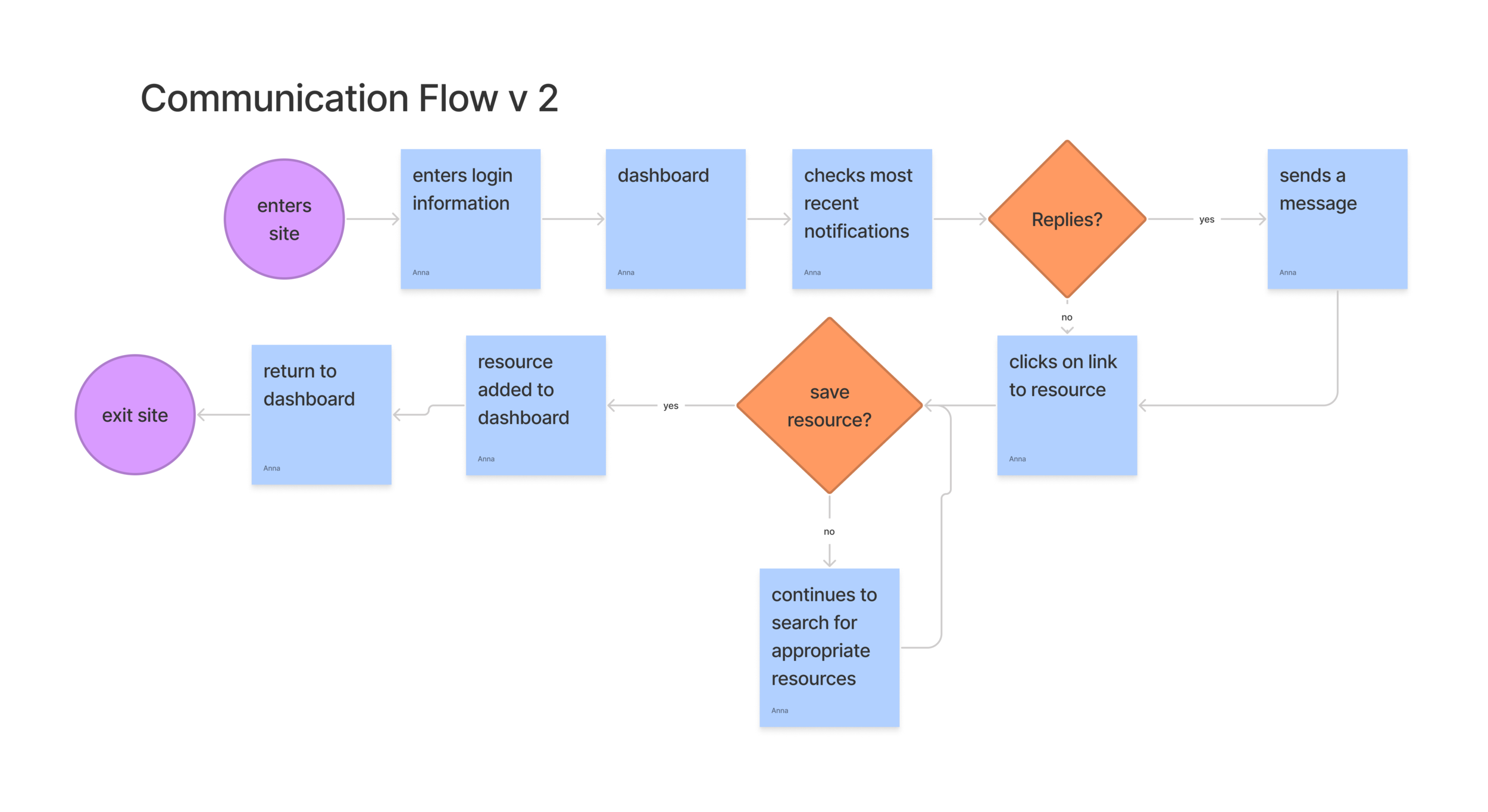
Checking communication and saving resource flow
Solving for X
Grayscale Wireframes
Because we were adding a feature to an existing product, we already had a design system to work with. Our client requested an uplifting, trustworthy parent portal in a color other than purple, which she had picked for the admin side of the app. Based on conversations with the client and our own research, we chose blue. Green, which matched the color of the logo, was suggested but then rejected because we wanted the portal to be accessible to people with red-green colorblindness.
In our mid fidelity prototype, we created Student Status cards (1) at the top of the dashboard, so parents or guardians could see their children’s social and emotional learning status at a glance, allowing them to prioritize their communications and follow ups.

We also highlighted new resources (2) and messages (3), since these were two areas of priority parents mentioned during interviews.
Usability Testing

To test the mid fidelity prototype and ensure it was meeting parents’ needs, we recruited five parents, predominantly sourced from the New York City area.
Our testing scenarios were based on our persona, Felicia.
Task 1: Your son is interested in furthering his knowledge about colleges he could apply to. Locate a resource with information on a college fair to support his interest and add it to your calendar.
Task 2: Your son’s parent coordinator said she would email you a resource about volunteering at the YMCA. Check to see if she’s responded to you, and if she has, save that resource so you can look it over with your son this weekend.
Results:
Our first round of testing yielded some interesting results. Despite the time we spent altering the navigation bar to help parents find the resources or communications they needed from any page, most participants focused first on the “New Resources” and “New Messages” on their home dashboard. One parent could not even complete the second task because she was unable to find the “Communication” tab in the navigation bar.
Iteration and Onboarding
The results from our usability testing defined our approach to iteration. We knew parents liked having a shortcut to their most important tasks on their landing page. But we noticed that parents were overlooking the navigation bar, which limited their ability to take advantage of the full functionality of the product. One of our participants even mentioned that the parent portal appeared to have a lot of functionality, but she would have liked an orientation that made her aware of all the features of the web-based app. Accordingly, we designed an onboarding sequence to direct users to features in the navigation bar and encourage them to select their notification preference (email or text). We also changed “Communication” to “Messages,” which testers suggested would be more intuitive and in line with their expectations.

Final Draft

Extra Credit

Because some parents mentioned using their phones to access their children’s EdTech platforms during user interviews, we knew making the parent portal responsive was a stretch feature we wanted to prioritize. Accordingly, we built a mobile version of the web-based app to help We Intervene’s developers make a responsive web-based app that was easy for parents to access at their home desktops or on the go.
Impact
Our client was ultimately pleased with the research we’d done and the parent portal that we’d designed. She is looking forward to pursuing translation options and was inspired to implement elements of the onboarding sequence in other areas of We Intervene.
The product is launching this year with a partner within the New York City school district. We look forward to seeing how it creates a holistic experience that helps the parents access resources and communicate with student support staff.
What I Learned
Recruiting Our User Base:
Parents are notoriously busy juggling the demands of work and their children, not to mention volunteering or spending time on self-care. Additionally, after more than a year of constant recalibration to the demands of learning during a pandemic–supporting their children during online or hybrid learning and adjusting to masks and social distancing in the classroom–parents had a high level of burn out. This made recruiting participants for surveys, user interviews, and usability testing very difficult. Although we sent out a survey, only six parents responded–not enough to give us any kind of useful data.
One strategy, based on Jared Spool’s UX research approach, would be to build relationships within communities of parents to show them how We Intervene could improve their lives, rather than create a new type of technology that they would have to learn in their already non-existent spare time. Because we didn’t have the luxury of this long-term research approach, we relied on our own networks, drawing on trust and relationships we’d already built, in order to recruit our participants.
Translation:
Although Google Translate was the NYC school district’s industry standard, further research is needed to determine if there are any pain points using this technology. We need to dig deeper to ascertain if there are any biases against use of Google Translate, especially in how it often fails to make translations sound colloquial. Since all our users interviewed felt comfortable conversing in English, more of an effort needs to be made to recruit non-English speakers or English language learners in order to get a sense of what translation technology they might prefer and what pain points they experience with EdTech designed in English.
Unmoderated Testing:
Partly because we struggled to recruit enough users within our tight timeframe and partly because we wanted to experiment with new technology, we explored methods for administering unmoderated usability testing through Maze and UserTesting.com.
Initially, Maze seemed to be a great solution, but its online technology didn’t interact seamlessly with our prototype. Despite multiple smooth runs during preview testing, once the actual test was administered, issues arose with users not being notified that they’d completed a task or tasks beginning on the wrong screen, stranding users in a strange corner of the prototype. Ultimately, we were unable to use those results because the Maze testing technology interfered with the users’ ability to interact with the prototype.
While UserTesting.com promised a much more in-depth picture of the user experience than Maze by offering video footage of the participants’ faces as well as encouraging them to narrate their reactions to the prototype, it also recruits from a pool of paid testers for their participation. This results in a phenomenon that Jared Spool calls “Professional Study Participants,” a user pool who might tick the boxes of our target user (parents with high school-aged children who live in New York) but might have familiarity interacting with new technology that far exceeds the average parent. While we shared the data from this round of testing with our client, we were careful to qualify the results with more context about the study.